Thought — 1 Min Read
Turquoise Blue
by Case Greenfield, December 6, 2022
Thought – 1 Min Read
Turquoise Blue
by Case Greenfield
December 6, 2022
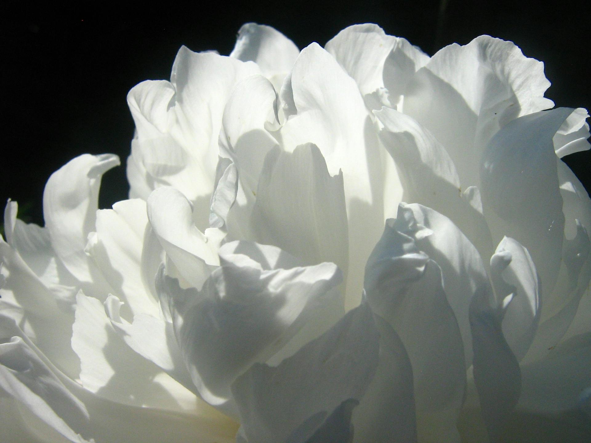
I have something with turquoise blue, phtalo-turquoise blue, turquoise green and other grey blue tints.

I am using the turquoise blue (Royal Talens Amsterdam Expert Series no. 522) and (some self created) variants at larges scale as the background of my Poppies series.
I find, it has a mix of comforting effect and scary effect at the same time. It is the color of the ocean on a quiet day, tending towards azure blue. Makes met think of the Mediterranean, where I would rather be right now instead of the cold Dutch autumn-winter weather.
But sometimes also, it gives me this alienating effect of the vast emptiness of the universe, when staring into the sky on a dry day at the Mediterranean coast. It’s confusing.
Water, ocean, sky, universe.
I like grey-blue tints. They feel cool, sturdy, stalwart, in a way, but also friendly and warm.

Here’s an interesting quote from Ms. Susana Carnicero (from the Blog on the website of the Fundació Joan Miró in Barcelona, Spain -Dec. 19, 2018) about the color blue:
Right after I graduated from university, I travelled abroad, and it was there, in a New York museum, where I made the priceless purchase of a postcard of a renowned work by Miró, Ceci est la couleur de mes rêves. At the time, this humble writer had little interest in Miró. I had no idea that the piece had been painted in 1925, when the artist was getting to know the surrealist group, and that the painting would mark a turning point in his career. But something caught my attention from the very first moment: that blue spot. That blotch that stained the surface of the painting like a mistake, and which, like an arrow, guided my gaze to the child-like handwriting that gave the work its title: Ceci est la couleur de mes rêves.

Painting-poem (“Photo. Ceci est la couleur de mes rêves”), 1925. Oil on canvas. The Metropolitan Museum of Art, New York. Gift of Pierre and Maria-Gaetana Matisse, 2002 © Successió Miró, 2018
The colour blue could be considered a relevant visual element throughout the History of Art. Many artists have acknowledged the power of its hues, making it the inspiring vehicle of their most prominent works. Personally, looking back to the avant-garde, I would like to highlight Pablo Picasso’s blue period, in which his paintings were filled with cold tones aimed at conveying a melancholy mood. In Eastern Europe, the members of Der Blaue Reiter (The Blue Rider), led by Kandinsky, worked this colour into their paintings as a symbol of spirituality and eternity. In France, Matisse used the intensity of blue in his ‘wild’ paintings as an emotionally charged vehicle of expression. Yves Klein also comes to mind –captivated by this colour, he ended up patenting a brand of his own: International Klein Blue.
And she’s right. Blue is an interesting color.